Sunday
May152016

 Like a large portion of kids who grew up in the Detroit area in the 1950s and '60s, I seem to have come out of the womb already fascinated by cars. I have clear memories of the two-toned black and white '55 Chevy my parents drove, and I can still recall the night when my Dad surprised my kitchen-apron-wearing Mom with a new metallic silver '57 Chevy station wagon. By 1964 I was going to the huge Detroit auto shows, collecting shopping bags full of new car brochures while goggling at the slinkily-dressed models draping themselves langorously all over new Buicks, Fords, and Chryslers. I then pored over the brochures for hours at a time back at home, admiring the photography, illustration, and type used in the layouts. My obsession with cars took new and expanded form as I began building model car kits, and soon I had subscriptions to Road & Track, Motor Trend, and Car and Driver magazines.
The magazines exposed me to the world of auto racing and exotic vehicles not made in Detroit, and for a brief period I harbored secret fantasies of being a Formula One driver like my then-heroes Jim Clark and Dan Gurney. It was while reading Car and Driver that I became familiar with the irreverent and frequently hilarious writings of one David E. Davis, Jr., a contributing editor at Car and Driver from 1962 until 1967.
In 1966, however, any thoughts of a more focused attention in automobiles quickly disappeared when a new interest appeared. Her name was Debbie, and from that point on cars took a poor second place to girls. I no longer made model cars, I stopped following Formula One results obsessively in the newspapers, and I let the magazine subscriptions lapse. For the most part I lost track of Davis, although he popped up in the news from time to time, such as in 1977 when Davis, by then editor and publisher of Car and Driver, moved the publication's editorial offices to Ann Arbor.
 Fast forward an alarming number of years to 2009, when my good friend and design colleague Mike Savitski let me tag along on a visit to a secret garage in Ypsilanti that houses dozens of classic and very rare sports cars and vintage autos in varying stages of restoration and repair. The real reason for the visit was Mike's planned visit to one David E. Davis, Jr. At the time Mike was working with Davis on a book project about a private auto collection and its owner, and wanted to pay a courtesy call on Davis during our time at the garage. Luckily for us, Davis and his wife Jeannie were available, and they graciously consented to a visit. I was unceremoniously ushered into the presence of the guy whose writings on cars and racing had fired my imagination so many decades ago.
For the next hour or so, Mike and I were mesmerized by Davis's rambling, almost stream-of-consciousness torrent of stories, tales, and anecdotes about racing, famous drivers he knew, wine in France, the food in England, even his near-fatal 1955 accident that required extensive facial plastic surgery. Very early in our meeting I let him know of my childhood subscription to Car and Driver and my then-love for road racing in all its forms, and that seemed to pique his interest. Toward the end of our visit he pulled out gigantic albums into which he'd pasted articles, photos, and printed ephemera about the racing world during his career as an automotive journalist, and I instantly knew that these albums were incredible and irreplaceable historical documents of racing and automotive history. For a few brief minutes I pored over those albums with the same fascination that had consumed me when I was a 12-year old gazing at the sales brochure for the 1965 Buick Electra 225 or an issue of Car and Driver containing an article about Jim Clark's latest Formula One victory.
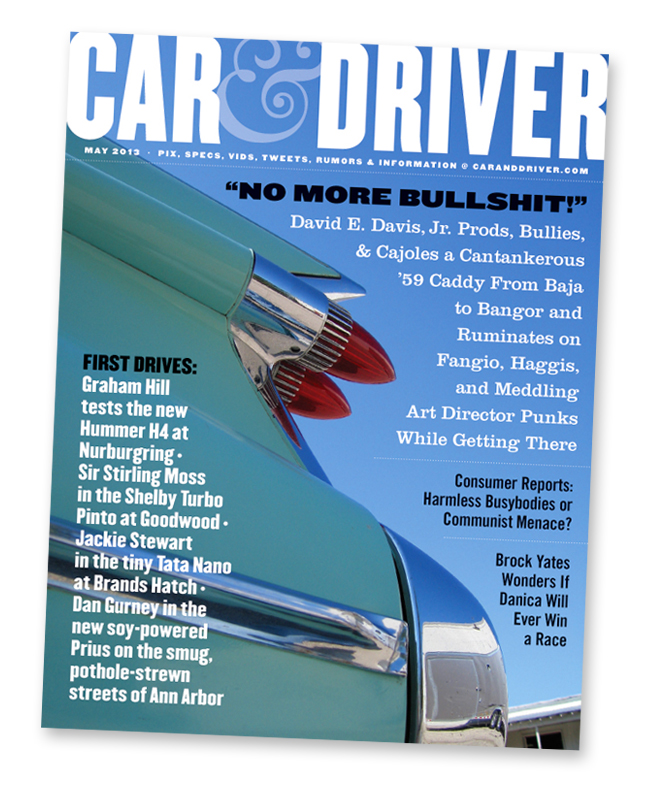
 In a photo that shows his irreverent personality, a union suit-wearing Davis quaffs a beer in what appears to be a VW camper. The photo appeared in Automobile magazine's memorial photo gallery."Larger than life" may be a horribly over-used term, but it applied perfectly to Davis. I knew from reading articles about his stewardship of Automobile magazine in the late 1980s and '90s that he could be irascible and cantankerous, but those traits did not appear during our meeting with him. Just like I found his writings to be in 1965, Davis in the flesh was hilarious, irreverent, informative, opinionated, and as entertaining as any person I've ever met. After our meeting with Davis and Jeannie was over, I wandered outside into the brilliant September sunlight and photographed a gorgeous 1959 Cadillac parked in a rear lot of the facility. I then put together a graphic and editorial homage to Davis in the form of a bogus magazine cover (above), but I never sent it on to him. If I had, he surely would have excoriated my graphic combination of the Car and Driver name with the famous ornate ampersand that Road & Track has used in various forms in its masthead for almost 60 years.
Fast forward two more years, and Davis was suddenly gone; in March of 2011, he passed unexpectedly following surgery. In September of that year, Mike and I again visited the secret garage in Ypsilanti, and a large banner hanging from the ceiling trusses proclaimed the phrase that Davis was said to have desired for his coat of arms, if he had one: "No More Bullshit."
To this day, I regret that I didn't have the opportunity to spend more time being regaled with his stories of Brands Hatch, Nurburgring, Sterling Moss, Graham Hill, and Dan Gurney, and Juan Manuel Fangio.
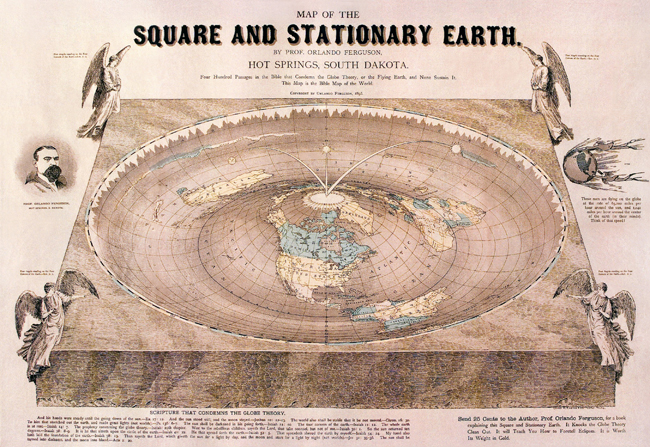
One of the best aspects of the internet is the occasional serendipitous encounter with an odd, fascinating, or downright hilarious item while searching for something else, and not long ago I came across a gem that was all three. It's a map published in 1893 that purported to show the correct nature of the earth—a "Square and Stationary Earth."
The publisher of the graphic gem above was Orlando Ferguson, a South Dakota real estate developer and self-styled "professor" who was obsessed with showing that the scientific notion of a spherical earth orbiting the sun in the void was false. Instead, Ferguson promoted the concept of an Earth that was based on his interpretation of Biblical scripture: "Four Hundred Passages in the Bible that Condemn the Globe Theory, or the Flying Earth, and None Sustain It. This Map is the Bible Map of the World." More information about Ferguson and his map is at: http://www.lifeslittlemysteries.com/1549-ingenious-flat-earth-theory-revealed-old-map.html
In technical terms, the Earth's shape depicted on Ferguson's map is an inverse toroid, but what is bizarrely curious is that it's a dead ringer for a giant roulette wheel—the Sun even looks like a roulette ball. Since Ferguson was a Biblical literalist, it's doubtful that he was making an ironically sly comment about the unpredictable, random nature of existence, but I'm curious about the anonymous, uncredited graphic artist who created and designed the map.
Accurately illustrating the toroidal shape of the Earth in a perspective view is a deceptively complicated task, and it's carried out with a fair degree of mathematical precision. The small angel figures and Ferguson's engraved portrait are also competently handled, as is the primary typography, so it's evident that the artist/designer was broadly talented and very probably had received formal training. I can't help but wonder if this artist was a fervent fellow believer in Ferguson's theories, or was this simply a project executed for payment by an artist who was privately ridiculing the notions that he was designing and illustrating?
 The Creation Museum's Garden of Eden depicts dinosaurs as non-carnivorous neighbors of Adam and Eve who only began eating each other after the Expulsion. Photo by Marta Alvira-Hammond.I have the same question regarding a contemporary example of the design disciplines: the Creation Museum in Petersburg, Kentucky. My daughter Marta visited the Museum in 2010, and her photos of the various displays show that the exhibit designers were competent professionals with a broad range of capabilities in typography, illustration, exhibit design, sculpture, and signage. That doesn't alter the fact that their overall purpose was to promote scientifically nonsensical views, including the assertion that Adam and Eve had dinosaurs for neighbors in the Garden of Eden 5,000 years ago. What is evident from the displays is that the entire enterprise is premised on accepting the Bible as literal truth; i.e., dinosaurs aren't millions of years old because the Bible says they aren't. Did all the various designers who worked on the Creation Museum exhibits believe in the messages that they were hired to promote, or was it just another paying project for them?
In an article currently on its website, Fast Company magazine asserts that "design" is a driving, critical force in Facebook. I won't repeat any of the dribble here, but I've provided the link at the bottom if you feel you must subject yourself to this exercise in fawing media coverage.
The article is farcical because Facebook has prospered in spite of its design, not because of it. From the beginning, its interface has been clumsy, confusing, poorly-organized, and visually chaotic; this latest re-design, the so-called "timeline," is simply the latest iteration of design decisions that would merit failure in any good college-level design program. FB's success is testament to the attractions and power of social media, and its canny leveraging of them. That Fast Company attempts to convince the outside world that excellence in design is part of that success is simply an example of how corporate power and a skyrocketing share price buy slavish media coverage. If you visit the article, read the comments by Fast Company subscribers—I'm far from alone in professional contempt for the interface design.
http://www.fastcodesign.com/1669445/how-facebook-finds-the-best-design-talent-and-keeps-them-happy
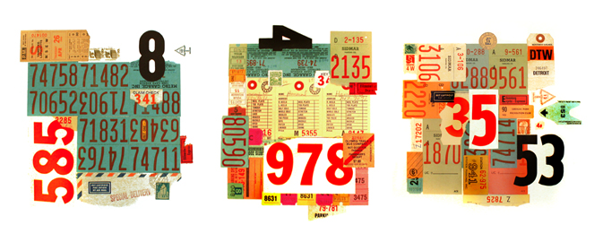
 Shortly after I began studying typography in art school, I developed a love for the anonymous, "non-designed" bits of printed ephemera that most people barely look at, especially the type and numerals commonly used on them. I began collecting interesting samples in earnest when I worked at SH&G, a large architecture firm in downtown Detroit. Since my daily work routine presented me with a constant supply of parking structure tags, restaurant receipts, and laundry tags, I began bringing them home with me. Soon I was expanding my collection to virtually every aspect of my life at home or at work, and it wasn't uncommon for me to pick up random bits of trash on the sidewalk because of a particular number or line of type.
I didn't really know what I was going to do with them at first, but gradually the urge to combine them into compositions took hold of me, and eventually I created four collages out of the materials I'd collected, seen above and below.
 Don Hammond